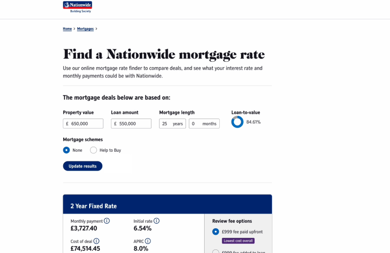
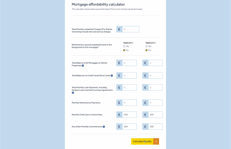
With a few personal experiences in property completion and a design background, I've embarked on the exploration of a crucial online tool in the homebuying journey, the mortgage calculator. My review delves into the mortgage calculators of six leading UK mortgage lenders, scrutinising their usability and accessibility.
The goal? To efficiently determine a lending amount and find a 5 year fixed rate mortgage product. From sleek designs and real-time validation to accessibility and product search capabilities, I've uncovered insights and top tips to optimise these calculators for users, streamlining their path to homeownership.
Top 10 tips
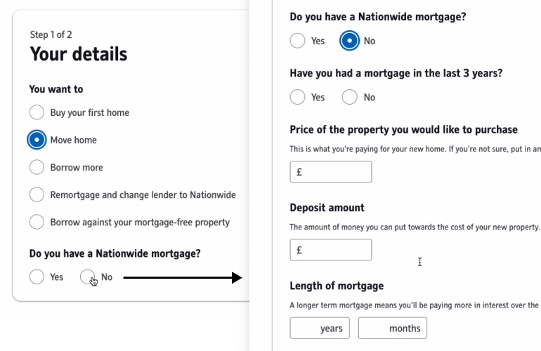
1. Dynamic questions
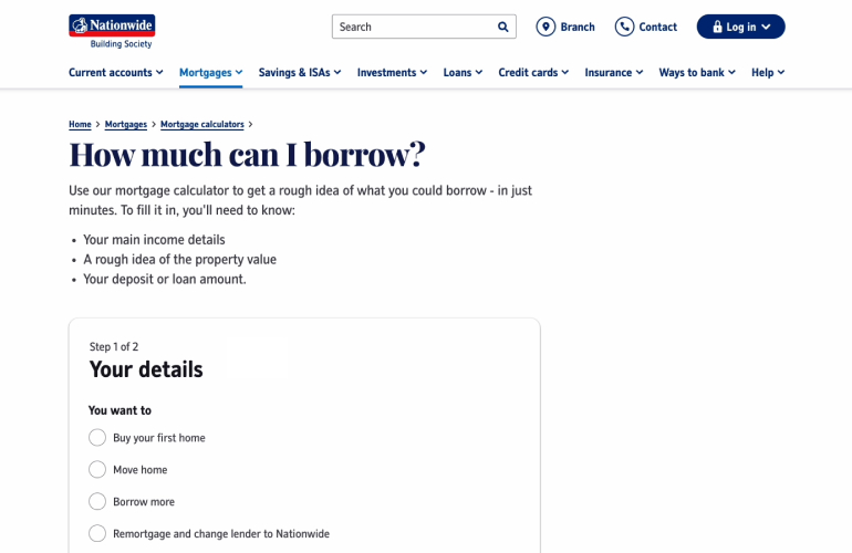
Simplify form completion by having dynamic questions that appear based on user choices. Tailor the form to each unique borrowing situation, reducing cognitive load and speeding up the process. This personalised approach, as seen in Nationwide's implementation, streamlines the user journey.
2. Immediate feedback
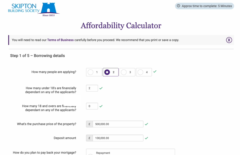
Enhance user confidence by providing real-time validation feedback during form completion. Positive validation can be indicated with green ticks, while incorrect inputs can trigger red crosses. This immediate feedback ensures users enter correct information swiftly and without frustration.
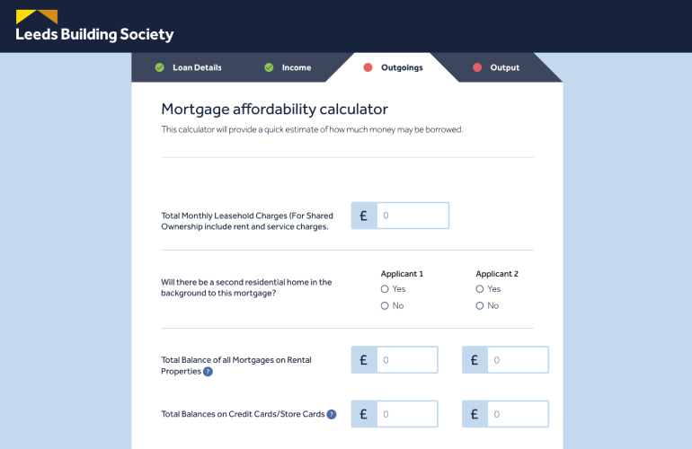
3. Progress indicators
Breaking the form up into steps with a progress indicator makes it more manageable to complete and allows for easier editing. Steps should be marked as complete when they are completed with the ability to go backwards and forwards to edit details. Including an estimated time to complete the process helps to enhance the experience further.
4. Clarify with tooltips
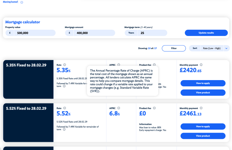
Maintain consistency in terminology to avoid any confusion. When using industry-specific or unique terms, display tooltips to provide clear explanations. This approach aids users in understanding complex or unfamiliar terms, promoting a smoother user experience.
5. Search & refine products
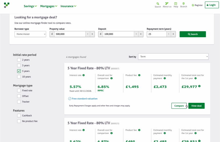
Improve efficiency by implementing a search, filters and sorting on the product results page. Users should easily find products that match their criteria, such as borrowing amount, property value, loan-to-value (LTV), and mortgage length. A clear indication of the number of products in the results list improves transparency.
6. Quickly view product details
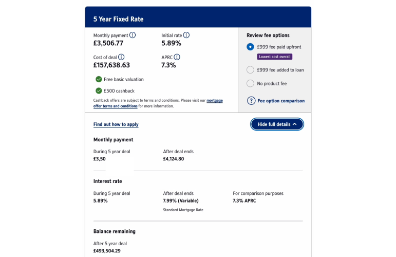
Enable users to compare mortgage product details without navigating away from the results page. This feature, as exemplified by Nationwide Building Society, streamlines the user experience and supports informed decision-making. A separate product landing page can be useful to show extensive information but more often than not, it's unnecessary and just adds a step to the user journey.
7. Ensure consistency
Create a seamless journey by integrating the calculator tool experience within your website. Use consistent navigation, styling, and interactive elements like logos that link back to the homepage. If technical limitations prevent full integration, provide clear paths back to the main website or the option to abandon the process. A cohesive approach enhances user experience and encourages exploration.
8. Reduce choice
Simplify decision-making for users by reducing the number of choices presented. The design principle of Hick's Law states an increase in options results in longer decision times. Focus on highlighting essential information, removing distracting elements and emphasising critical content through visual hierarchy.
9. Compact layouts
Opt for efficient, 2-column layouts, particularly for multi-applicant scenarios. These compact layouts expedite the mortgage calculator process by making forms quicker to complete. Avoid excessive white space that may impede the ability to locate information and increase scrolling.
10. Accessibility
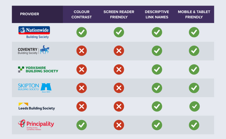
Accessible websites create digital experiences that are available to everyone, regardless of their abilities or disabilities. It ensures that all users can fully interact with and benefit from using your online tools.
To ensure screen reader compatibility, check your code associates multiple choices selections with the correct question and connects field labels with the relevant fields. Also, avoid custom form styles that may hinder a screen readers ability to understand the form.
Check colours have adequate contrast using the Web Content Accessibility Guidelines (WCAG). Evaluate colours used for error messages, deactivated steps, and content in pop-ups, which can be overlooked during testing. Maintaining adequate colour contrast enhances readability and accessibility for all users, including those with colour blindness.
Summary
In the world of property acquisitions, mortgage calculators play a pivotal role at the start of the property completion journey. This review of top UK mortgage calculators has unveiled some critical UX insights. Although my insights are subjective, I feel that following these tips would improve user experience, reducing the time needed for users to make choices and ensuring a smoother path for everyone to find a suitable mortgage product.
Download the reports
Dive deeper into the intricacies of the mortgage calculator UX reviews by viewing the individual report on each mortgage provider.
Nationwide Building Society Mortgage Calculator UX Review
Coventry Building Society Mortgage Calculator UX Review
Yorkshire Building Society Mortgage Calculator UX Review
Skipton Building Society Mortgage Calculator UX Review


