The majority of time spent on the internet is now on mobile devices
Ofcom published in their Communications Market Report 2018 that UK adults spend on average 3 hours per day on the internet and 62% of this time is on their phones.
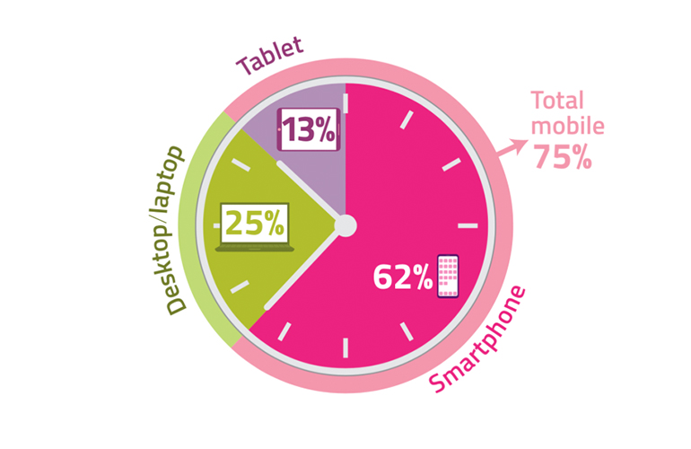
Historic Communications Market Reports from Ofcom show that mobile usage overtook desktop usage on the internet around 2014 with mobile usage only being 20% back in 2012.
The continued rise in mobile internet usage makes considering mobile website design even more valuable than ever, so here are my top 10 tips!
1. Define key website performance indicators
Monitor the UX health of your website by measuring how features/tasks tie into larger business objectives.
What are the vital signs of your business?
e.g. online revenue targets, number of customers etc.
Define UX performance measurements based on business objectives
e.g. conversion rate, video plays, page visits etc.
Decide how and when to collect data
e.g. Google Analytics (event tracking), Hotjar, usability testing etc.
2. Understand your user’s behaviour
Reduce opinion-based decision-making, increase conversion rate and improve user retention by conducting user research.
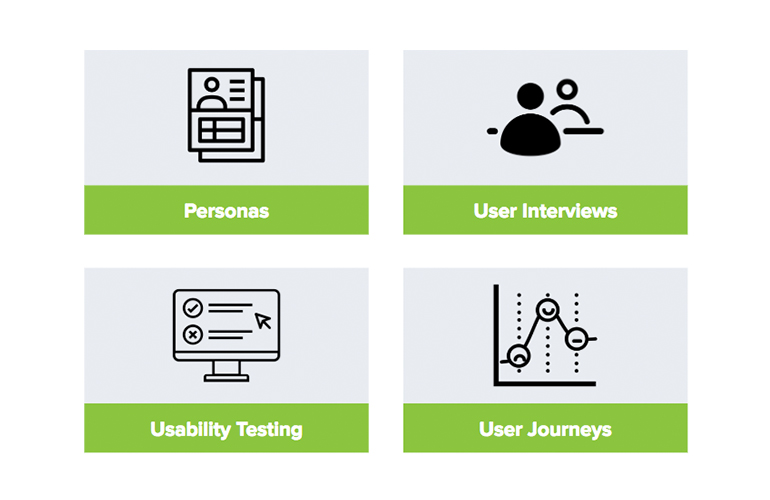
We use testing methods that are quantitative and qualitative here at Indulge.
Quantitative Research
Answers: How many? How much? Metrics based studies and usually large sample sizes.
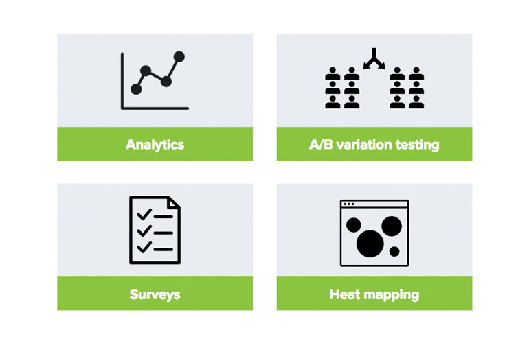
Qualitative Research
Answers: Why? How can we fix it? Observational and subjective studies, usually small sample sizes.
Data Triangulation
Our UX understanding is improved through triangulation of multiple data points, for example:
- Google Analytics: Uncovers high value mobile pages with high exit rates.
- Usability testing on mobile devices: Discover how users are struggling to find the low value page.
- User journey: Visualise each step in the task and the emotions of the user.
All methods in this example have helped to uncover a common UX problem and play their part in producing a solid recommendation for the mobile design.
4. Organise key content & features
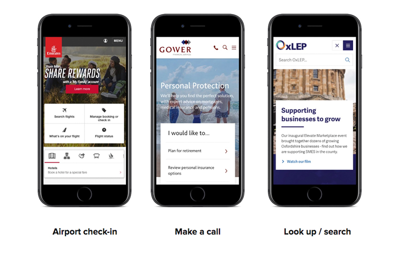
Align key content with the needs of your users on mobile devices. Focus on prioritising content over navigation.
4. Extend your capabilities
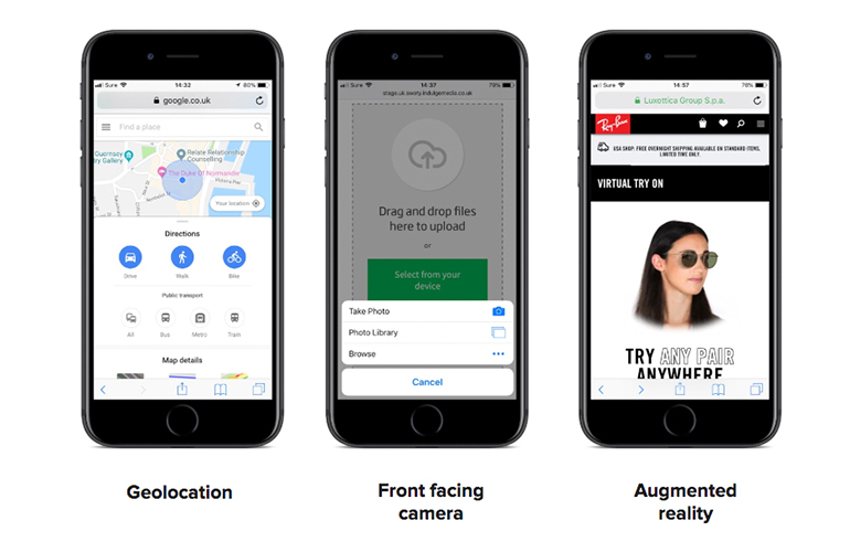
Deliver innovate experiences by building on new capabilities native to mobile devices.
5. Design for mobile first!
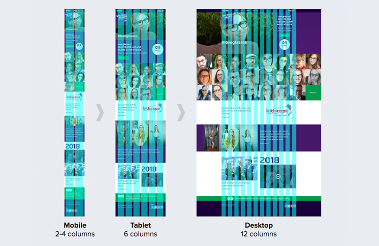
Designing for a smaller screen first forces you to focus on and prioritise content and features by embracing the constraints of mobile in the first instance.
During the design process for the Specsavers Spectacle Wearer of The Year website we started off with a mobile design and expanded this out to desktop. The mobile design is much more compact and has 2 columns in the design grid, compared to 12 on desktop.
6. Design big for small devices
Use a body font size around 16px, to be as readable as the text in a well-printed book.
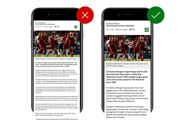
Use large touch targets for buttons. Apple’s iPhone Human Interface Guidelines recommend 44px, Microsoft recommend 34px, Nokia 28px and an MIT study suggests 45-57px.
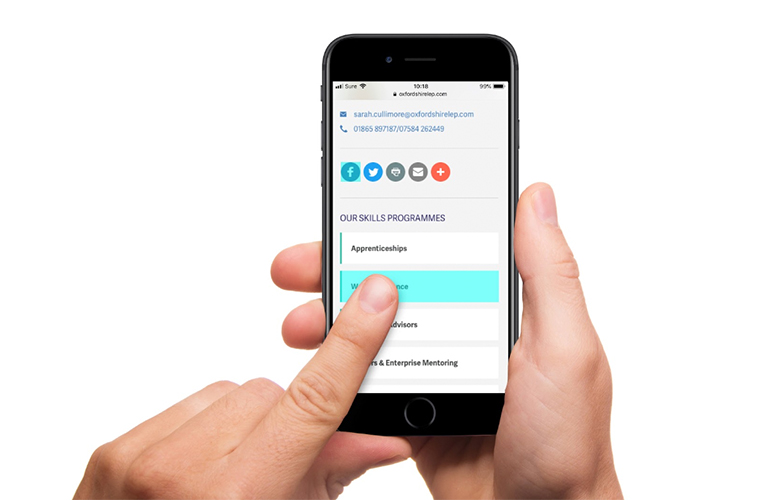
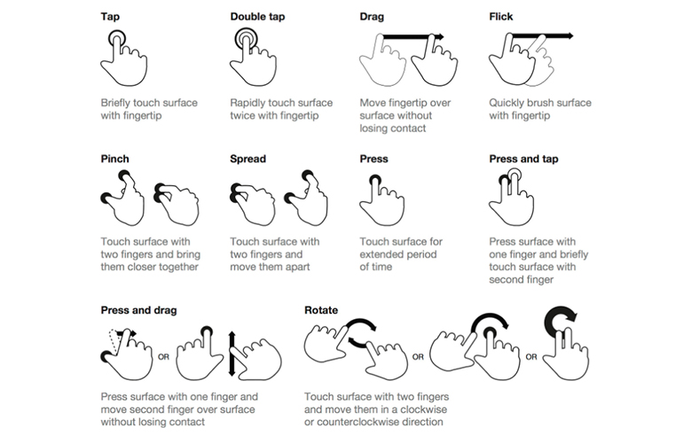
7. Use touch gestures
Experiment with touch gestures on mobile devices but stick with buttons for primary actions to ensure clarity and accessibility.
8. Avoid complex tables
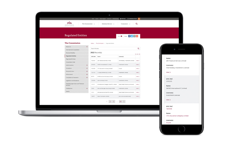
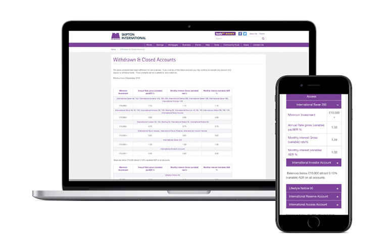
Plan to render complex tables of data in a more accessible way on small devices.
For the Guernsey Financial Services Commision website we designed tables that combine each column into a single width cell when displayed on phones.
For the Skipton International website we designed tables that collapse and expand in a suitable way for smaller screens.
9. Reduce load speed
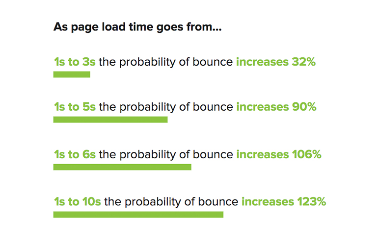
53% of mobile visits are abandoned if your website takes longer than 3 seconds to load (Source: Google Data, Mar. 2016) - making load speed essential to retain traffic on your website.
Here are some additional stats related to how load speed increases bounce rate (Source: Google/SOASTA Research, 2017):
10. Ongoing UX research
The possibilities with mobile design and the behaviour of your users is constantly changing, so my final tip for successful mobile design is to obtain feedback and conduct usability testing on a regular basis with your target audience.
Our UX research process involves creating an initial benchmark report and then ongoing comparison reports to compare the impact of our design recommendations. This comparison process ensures that we're making improvements on your website that are working positively towards your business objectives.
In Summary
Do
- Define website performance indicators
- Understand your users
- Keep your font size readable
- Keep your website light and fast to load
- Evolve the design through ongoing UX research
Don't
- Ignore mobile phone capabilities
- Overcomplicate the layout
- Use small links
- Neglect complex tables
- Leave mobile design to last!
Please get in touch if you would like to learn more about how our methods can deliver better results for your website on mobile devices.


