Over the past year, nearly all of our studio time has been dedicated to working on lots of new and exciting client work as well maintaining existing client websites. Over this year websites and digital technologies have shifted very quickly and the web has become a more interactive, usable and social space than ever before.
We have also seen a huge change in how we consume the web. No longer are we just browsing on our desktops. We now live in a world where we are constantly connected. Of course we are talking about the rise of smartphones and mobile. It is estimated that by the end of 2013 the amount of people browsing the web and using apps on their mobile phones will overtake desktop use. As such, having a website that is mobile ready is crucial in order to retain your customers and engagement with followers.
After spending a lot of our time adapting these practices and trends to our client work, we have struggled to find the time to apply them to our own company website...until now! Work has finally commenced version 4 of the Indulge website and by golly its looking awesome. What’s more, we want to share it with you!
Discovery
Before starting any client project at Indulge, we always commence with a discovery phase and sit down with the client to discuss the project requirements. For the new Indulge website project we followed exactly the same process and treated ourselves as the client. During this stage we completed one of our own client briefing sheets. Completing this briefing sheet gave us a complete and clear overview of the project goals and requirements.
Discussion
Once the project brief had been established, we then presented the brief to the Indulge team and opened the project up to a team discussion where everybody had their opportunity to pitch their ideas for the new website. After hearing everybody's ideas it became very apparent that the everybody in the team shared the same vision.
During this process we also looked at a large number of digital agency websites for inspiration and ideas. Here are three of our favourites:
• Teehan Lax - http://www.teehanlax.com/ - @teehanlax
• Humaan - http://www.humaan.com.au/ - @wearehumaan
• Happy Cog - http://happycog.com/ - @happycog
Key Features
After hours of discussion and collating everybody’s ideas for the new Indulge website we were able to produce a list of six key features for the new website:
1. Lets get responsive - Our new website needs to look amazing on mobile and the best practice of doing so is by making the website responsive. Making a website responsive means that you design and build the website in such a way that it adapts and resizes to the device you are viewing the site on. By making a website responsive you ensure that you deliver the user exactly the same useable experience and content no matter what device they are viewing the website on.
2. Keep it simple - Our new website needs to be as simple and streamlined as possible. A number of team members felt that the current website was chock a block full with content that was too heavily focused on obtaining a decent search engine ranking. These days there are other practices that can be adopted to retain your search engine position. It was therefore decided to adopt these processes and to simplify our site content to make for a much more digestible and usable experience.
3. Beautiful design - Our new website not only needs to be easy to use but also amazing to look at. We will be adopting modern web design practices in order to present a truly slick, beautiful and interactive experience to the user. Fast internet speeds, rich digital media and large displays give us much more visual real estate to work with and with the website also being responsive this ensures that the website will look just as good on a mobile and tablet as it does on a desktop.
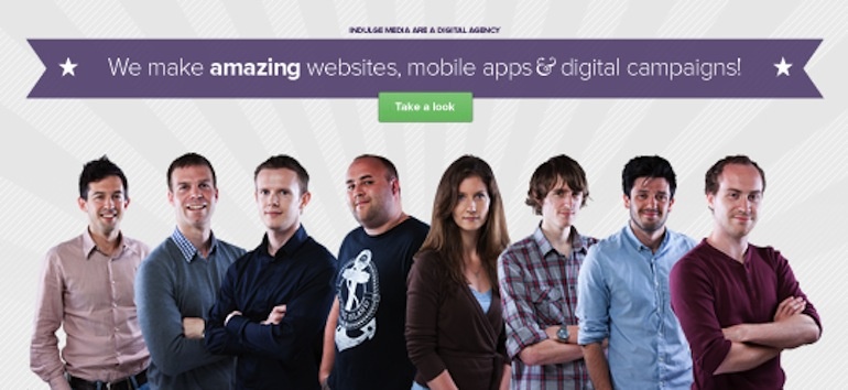
4. Reflect our personality - Our new website needs to reflect the studio and company personality. With the new website we want to reflect what it is like in our studio. By meeting our team, learning what we get up to and having a tour of the studio itself, both new and existing clients can paint a true picture of the company that they are working with. A great idea came out of this which was to have a bacon roll counter on the homepage. Basically, everytime we launch a new website at Indulge, we have a round of bacon rolls. Having this ‘Bacon Roll Widget’ not only reflects our company personality but it also showcases the amount of work that we do.
5. Portfolio showcase - We need the new website to truly showcase the amazing work that we do. One of the main concerns with our existing website is that it really doesn't showcase well the work that we do in the studio. It is therefore a key requirement that the new Indulge website has an amazing portfolio section to present all of our work and projects. Perfectly presented site designs along with custom artwork for each portfolio piece will ensure this.
6. We are connected - Social media is a big thing here at Indulge. We are constantly on Twitter & Facebook debating digital topics, sharing our blogs or just posting interesting and humorous content. The website needs to reflect this connectivity with the digital cloud and so needs to be tightly integrated with all of the social media channels that we use.
In the next part of the this series of blog posts we will be showcasing the site planning and design process but in the meantime here is a sneaky peek at our initial homepage concept. See you soon!


