When redesigning the Guernsey Competition and Regulatory Authority (GCRA) website, the goal wasn’t just to modernise the visuals — it was to create a digital platform that genuinely works better for users.
As Guernsey’s competition law enforcer and utility sector regulator, the GCRA serves a broad audience, from legal professionals and government officials to everyday consumers. The organisation manages a large volume of regulatory information, guidance, and case documentation — all of which needed to be easily accessible, searchable, and well-structured online.
The Brief
Our task was to design and develop a modern, secure, and user-friendly website that:
- Presents a large volume of PDF documents in an engaging, easy-to-navigate format.
- Offers seamless content migration from the legacy platform.
- Delivers a dynamic homepage with multimedia elements reflecting the GCRA’s professionalism.
- Provides staff with a manageable content system backed by robust security.
The goal was to improve user engagement, simplify access to key resources, and support the GCRA’s role as a trusted regulatory authority.
What We Did
We approached the project with accessible UX design at the centre — not as a bolt-on, but as a guiding principle from the start. From navigation and content structure to design systems and development, every element was considered with real users in mind.
Here’s how we did it:
Redesigned the Information Architecture
We restructured the site’s content to make it easier for users to find what they need. We simplified the main navigation, added clear signposting across pages, and created consistent pathways through dense regulatory content.
Introduced a New Design System
The site was rebuilt using a modular design system tailored to the GCRA’s new brand. This ensured consistency across templates and components, while giving editors more flexibility to create content that looks great and functions well across different devices.
Improved Accessibility from the Ground Up
Rather than audit and fix accessibility issues later, we embedded accessibility into the design and development process from day one. This included:
- Checking colour contrast ratios
- Using semantic HTML and proper heading structure
- Enabling full keyboard navigation
- Adding descriptive labels, alt text, and focus states
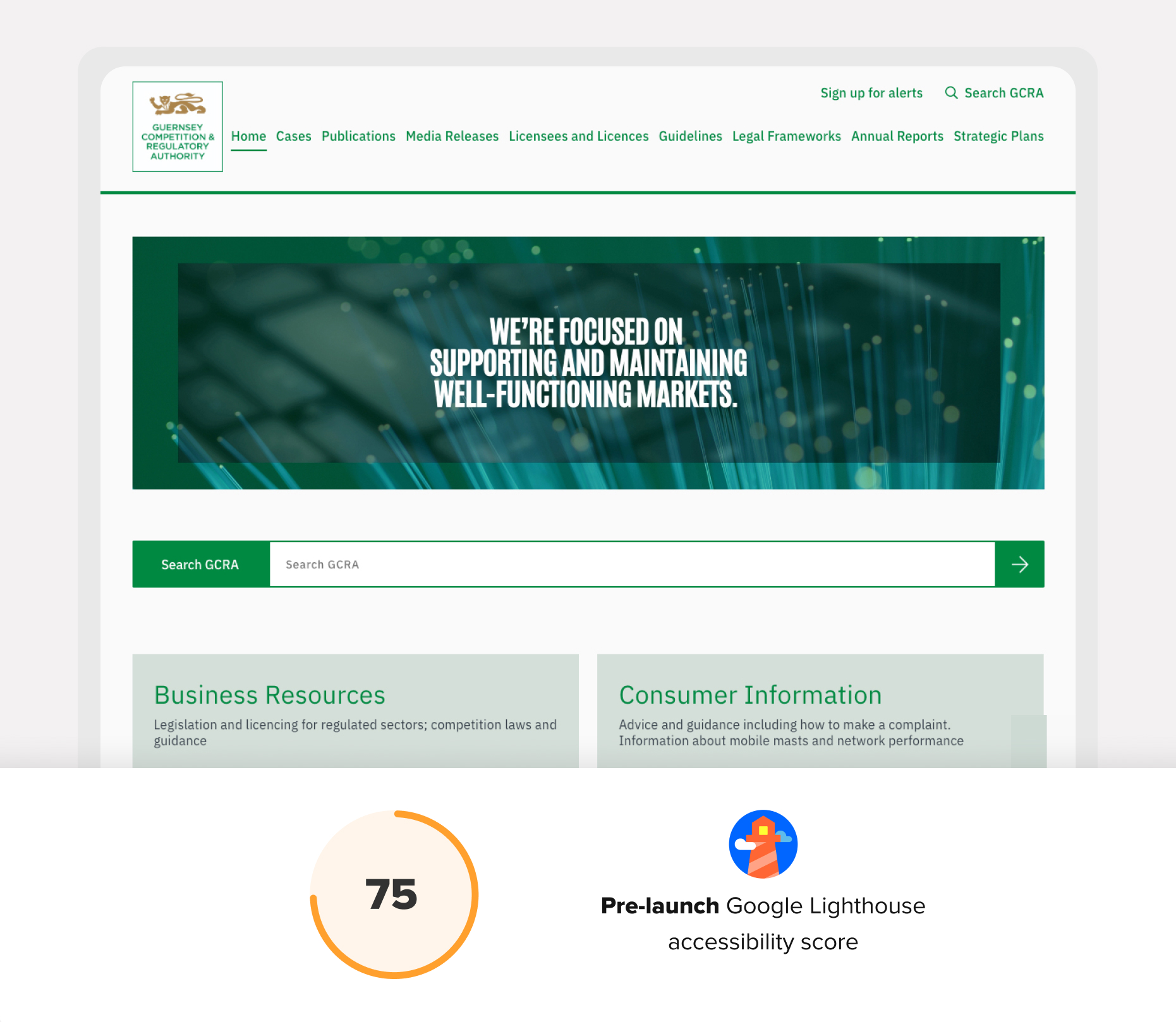
We continuously tested against WCAG 2.2 standards and used tools like Google Lighthouse throughout — not just at the end.
The original site scored 75 for accessibility in Lighthouse — already a decent baseline. But after the redesign, that score rose to 100. More importantly, we eliminated issues that could impact real users relying on screen readers, keyboard navigation, or older devices.

Measurable Results
Accessibility improvements were just one part of a wider effort to enhance the experience. And it paid off — here’s what changed in the three months after launch compared to the three before:
- Engaged sessions per active user up 60% - More users returned to the site and engaged with multiple sessions, indicating stronger trust and interest.
- Views per active user up 28% - Visitors explored more pages per visit, suggesting clearer navigation, better content structure, and more intuitive design.
- Engagement rate up by 18% - More users stayed on the site and interacted with the content, a sign that it was easier to use and more relevant to their needs.
Final Thoughts
Great UX, performance, and accessibility go hand in hand. By focusing on structure, speed, and smart features like AI-powered search, we’ve delivered a site that helps users find what they need—fast.
Whether under pressure, on the move, or just looking for answers, the new GCRA platform works better for everyone. Or in their words—“a seamless, modern, and highly functional website that exceeded our expectations.”