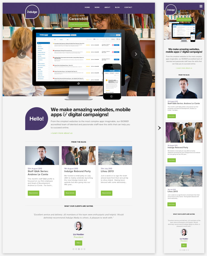
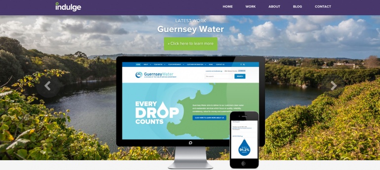
Our new site is live and it's full of some great new features. I could probably spend hours talking about all the little details that make the site special, but here are my top 5 favourite features that really make it shine:
1. Super-responsive

If you're on a desktop try resizing your browser window. The website not only works well at all resolutions, is does so without any ugly snap points where the website 'sticks' to 3-5 preset page widths. The website will gracefully and fluidly fit to the correct width. The best example of this is the homepage.
2. Screen scroll

When the website displays some of our work in a widescreen or mobile screen, you can scroll up and down by dragging the image around or using your mouse wheel. This is a great way to show how critical really great responsive design is to a website. It's built in a modular approach with custom events so it works well with other modules, like the homepage gallery animation (interaction with the screen pauses the gallery time). If you've got a sharp eye you might notice how the screen has a gloss that goes over the website image even as you scroll. There's a whole load of screens to scroll through on the work page.
3. Asynchronous Paging

If you're on a page in a list (Blog posts or Work pages) then you can hit the < & > arrows near the top of the page to go forwards and backwards in the list. The next paged is loaded asynchronous (without a refresh) an slides in to replace the current page. We built our own HTML5 history management framework to get this working with better customisation options in terms of content injection (the slide effect) and improved cross browser support.
4. Bespoke responsive grid

There are a few things that we wanted to do with grids that can't be done (elegantly) with other grid systems. After testing all the major grid frameworks decided to make my own. My new grid system really deserves it's own blog post so I'll go into more detail later, but it's key features is that there's a really elegant way of doing long grid lists where you can change the number of items per row with a single media-query. Check out the clients page for a good example.
5. Adaptive Images

If you've got a small screen there's no point in downloading huge background images, but if you're on a large screen you don't want to see ugly pixilated images, so we've implemented a system that sends you the right image for your screen size. Even if you increase your screen size while still on the page, the images will adapt and update with higher resolution versions. There's a number of different solutions for adaptive images out there already but they usually have issues with older browsers, are heavily reliant on javascript, or don't work with content delivery networks (CDN). Our preferred system was great in most respects but didn't support CDN, so we built our own system based on the best concepts from a few systems.
So there's my top 5. Have a look around and let us know what you like best. All feed back is welcome, you can contact us via the contact page.


