We’ve spotted a new trend, or anti-trend you might say. Web-brutalism is on the rise. It was spotted some years ago, and takes inspiration from art and architecture. It’s stark and craves attention, and could be the UX answer we’ve all been looking for. In this post, I’ll look at what web-brutalism is and what it means for UX and UI design on the web.
UI = UX
Where do user-interface design (UI) and the user-experience (UX) overlap? Well, the UX is ultimately a result of the design. A user’s journey is impacted by the stylistic choices that are made by a website’s designer.
This means that when designing a website, you must ask yourself, what purpose do my UI choices serve? Have you chosen your UI design to serve the viewer or to force some impact upon them? Are you designing purely with empathy towards the user’s experience or are you making decisions that have a satisfactory value to yourself, but don’t serve the requirements that the customer would choose for themselves?
Banana or Pineapple?
Think about this - You must choose a healthy fruit to take with you to work. You measure the value of the fruit on three things; firstly accessibility - how easy it is to carry, consume and use? Secondly the fruits ripeness is important - how do you know when it’s ready to eat? Finally you consider its taste - do you like to eat it?
You consider the banana, with its easy peel protective skin and darkening colour that shows when it’s ready. The pineapple on the other hand is clunky, tough to peel, and you have no idea when it’s ready to eat. The banana meets the brief and wins the day.
This makes sense, its practical and it works. If fruits were like websites, the banana would be considered on-trend. But how many days could you keep choosing the banana until you found the pineapple appealing, despite its obvious UX flaws? Well this theory lightly explains the rise of web-brutalism.
What is web-brutalism?
The term ‘brutalism’ doesn’t derive from the English word for brutal, and is detached from this meaning etymologically. Instead it is formed from the French words ‘béton-brut’ which translates as ‘raw-concrete’ in English.
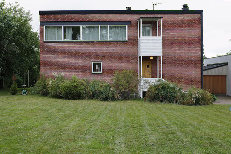
Coined by Swedish architect Hans Asplund in 1949 to describe the Villa Göth in Uppsala it later became adopted across Europe during the 1950’s becoming a cost effective way to produce housing post-war. However the approach became popular for its futuristic style and honest aesthetic. Hans Asplund later describing it as “a striving to create simple, honest, and functional buildings by, for example, not allowing them to create associations or emotions.”

Enough is enough

Web-brutalism was a first recognised around 2010 after a style of digital art led to an emerging production trend of brutalist websites. Creative Director, Pascal Deville of Freundliche Grüsse first noticed the rise of these sites, leading him to publish the website www.brutalistwebsites.com in 2014.
So why did web-brutalism emerge? Like most art movements web-brutalism is a reaction of a prevalent trend in society. The standardisation of web design is all to common, with websites running on templated themes, 960 grids with flat button design. With the success of WordPress and template markets such as Envato, it is now easier than ever to deliver safe, reliable websites using ‘best practice’ protocol. Much like its 1950’s counterpart, web-brutalism has sought to find a new approach to challenge the regular and expected.
Commercial web-brutalism
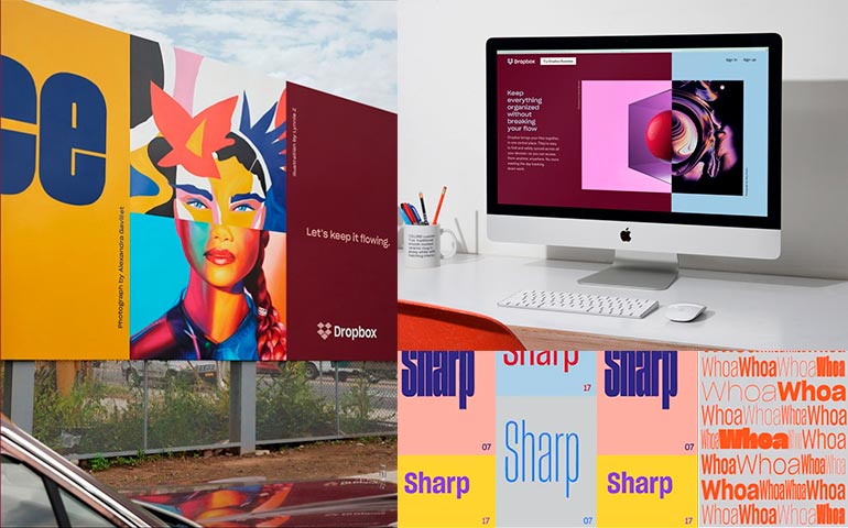
It took some years for this disruptive ideology to make its way into the commercial world, but in 2017 after 10 years of success as an online file hosting service, Dropbox Inc. made the decision to rebrand. Produced by design agency Collins the branding is in reference to the collaborative, creative market that it serves. Explained by Dropbox Creative Director, Aaron Robbs & Vice President of Design, Nicholas Jitkoff:
“Our new design system is built on the idea that extraordinary things happen when diverse minds come together. We communicate this visually by pairing contrasting colours, type, and imagery to show what’s possible when we bring ideas together in unexpected ways.”

It’s a clever thought, and one to be respected. It makes sense strategically for Dropbox to appear differently inside a file sharing market that is dominated by some big players. This is because their advertising is looking to marginalise on a higher brand share, rather than for new market growth. To explain this we can look at the domination in other markets like soft drinks by leaders such as Coca-Cola, which means that competitors such as Pepsi have to deploy strategies that convert customers to their brand, rather than pulling in new ones to the market. This is because the attraction of new customers to the market will likely be channeled towards the dominant market leader.
The role of web-brutalism in communication: getting attention
Dave Trott, the advertising and copywriting champion often advises and approach that ‘targets the problem you can solve, not the one you can’t’. For Dropbox this means standing out and positioning themselves as understanding the needs of their creative users in a way that their competitors don’t, rather than just looking for a higher rate of sign ups. Trott explains that the first three steps to effective communication are:
1. Getting on the customer’s radar - getting noticed and being heard
2. Communicating - getting your point across
3. Convincing - getting your audience to act
To describe this further, imagine asking a friend to make you a cup of tea. Firstly you get their attention, without their attention, it doesn’t matter how well you can convince them, because they’ll never hear you. Next you make your request. Lastly you convince them of why they should (i.e ‘I’ll take the bins out, if you make me a cup of tea’). In a digital marketplace where getting the user to engage with your brand can often be a one-link-click, it is important to stand out from the crowd.
We can see a brutalist approach applied in other industries, with campaigns like the Go Compare opera character, or the Compare The Market Meerkats. These are obtrusive constructions that leave the viewer with a jarring but memorable experience. Once their attention has been captured, it’s quickly onto steps two and three; the presentation of services and reasoning.
A brutalist Bloomberg

You can see how this approach lays the foundations for a successful marketing strategy and may explain why we are seeing more businesses move towards a brutalist style.
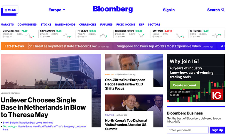
Some creatives have adopted this approach to also deliver a superior user experience. Josh Topolsky, editor of Bloomberg Digital explains - “What drives me insane in modern web design is grids...what’s important is a page that moves.” These comments follow after he spearheaded the Bloomberg Business website redesign gaining the attention of critics like Venturebeat which said it “pulls you in as much as it spits in your eye.” Topolsky explains that the style is inherited from the DNA of the Bloomberg magazine, while the the structure of the site is “built from these blocks so we can snap them together like lego.” Instead of using rigid grids.

Similarly to other art movements, it is subjective and not everyone will appreciate its thinking. However this brutalist philosophy aims to excuse itself from outside aesthetics and remains unapologetic for its choices. It behaves exactly how it wishes too, without conforming to the expectations of a third party. In this sense it is able to deliver a system which is robust and pragmatic, without concern to its presentable form.
The future is for the brave
The web-brutalists of today are responsible for calling out the conformists, encouraging them to break the mould and shake free the corporate anxiety of the new. In a time where the template style has dominated, web-brutalism snaps at its heels and offers a new language of web design. We can expect to see it evolve as it becomes inherited and transformed by different parties. This could mean the commercial aspects of the ideology may be adopted by mainstream groups while other archetypes such as www.lingscars.com go down in history for their use of parody, satire and well, a lot of GIFs!
What web-brutalism is all about
The designer who employs a brutalist approach is certainly looking to break the mould. It may be said they are brave or even foolish, but isn’t that what being creative is all about? Taking risks. If you are simply following the trend, then it probably is a mistake, for you will miss the intent. But if you understand the empowerment that brutalism can offer you and your audience then you can use it to deliver modular desolation, seeding in the potential for new ideas to grow. Whether this means a repositioning of your brand, or a UI choice that gives you the functions you really want.
It is the designer saying they’ve had enough of aesthetic demands and taking back some of the control. It is a less empathetic and more self-serving thought process that has naturally arisen due to the modern climate of overt user accommodation. Like any big character in history it is not without it’s controversies, but it seeks to remind us that there is always another way, whether for the good, the bad, or the ugly!
Brutalist Web Examples
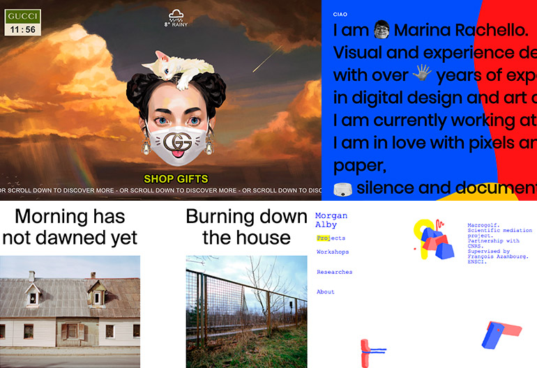
Womens gifts by Gucci, uses a mod-renaissance Brutalist style.
Outline offer a reformed Brutalist style using elements of Pop Culture.
XXIX offers a strange overlay of UI and content elements.
Preface experiments with different dimensions of image gallery display.
Lazy eyes plays with game like interaction and randomised content.


