It’s 06:17 on Saturday 31st August.
As the sun rises, the bean-to-cup coffee machines of Britain creek into life. Thousands of people open up laptops that are usually reserved for weekday work activities.
Sitting aside the laptops are any other internet-connected devices they can lay their hands on.
Why? Because the long-mooted Oasis tour tickets are about to go on sale.
When I say ‘about to’, I mean in more than two and a half hours.
So horrendous is the ticket-buying process, though, that anyone with an ounce of sense knows that to stand any chance, you need to get online in good time.
There’s no other way
So keen was I to avoid the clichéd Oasis song lyrics in this article, I’ve used one from Blur instead.
But the truth is, there is currently no other way.
If you would like to attend a concert of this hype level, you need to become an internet resident with the patience of a primary school teacher.
The sad truth is that the events of the weekend just gone were predictable yet shocking. The state of online ticket sales has been and remains a painful experience.
The good news is that it’s a great demonstration of what happens when UX and digital strategy go wrong.
How the story unfolded
The story of the Oasis ticket purchasing process has been well-documented over the past few days, so here is a short version.
Tickets (for the England shows, at least) were available across two websites; Gigs & Tours and Ticketmaster.
Gigs & Tours essentially went and hid in a corner, somewhere.
Ticketmaster on the other hand implemented a toxic web of queues.
If you were fortunate, you made it to queue number one, to get into the Ticketmaster website itself.
Once on the site, you had a frantic scurry to the Oasis tickets page, selected your date and entered queue number two; the waiting room.
To be honest, you were lucky if you made it safely from queue one to queue two because the website would almost certainly have booted you out before then.
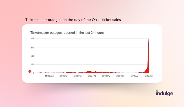
If you didn’t get to see queue two for yourself, let me paint a picture; pick a random number between 200,000 and 500,000. Now picture that number on a webpage.
The very big number was a countdown; in this case, the number of people in the queue who were ahead of you.
The capacity of Wembley Stadium is around 90,000. When I joined the queue in the waiting room, there were circa 350,000 people ahead of me.
As they say in America, you do the math.
Despite having more chance of winning the lottery, I decided to give it a go.
At the front of the queue, five hours older, it was time to be thrust into the ticket selection process.
Unless you’d pulled the golden ticket from your chocolate bar that morning, you probably got your first glimpse of Ticketmaster’s ‘Platinum’ tickets
Platinum tickets are a lot like normal tickets, except you pay a lot more for them. That’s because they are in demand, and as we all know, the normal tickets weren’t in demand at all, so it makes perfect sense.
Now, whether there’s justification for surge pricing or not is a debate for somewhere else, however, Ticketmaster committed a big UX sin at the final step.
A countdown timer to purchase your tickets.
So, let’s take a look at the UX and digital strategy failure points.
Failure point 1 - the strategy
The internet is about 40 years old.
Amazon, arguably the first truly successful online merchant, started 30 years ago.
Things have been sold online for a long time.
Things like books, washing machines and, come to think of it, tickets.
Despite years of practice, it would certainly appear to me that the strategy behind selling tickets online for high-demand events is lacking.
Here’s what our resident web hosting expert, Patrick Cunningham had to say; “no website in the world could handle the volume of people trying to buy tickets from Ticketmaster on Saturday morning.”
The important thing about strategy is that you understand the facts of your current situation.
Roughly 1.4m tickets were sold on Saturday, and many more millions had a go at getting some.
Any strategy should know that if you launch 1.4m tickets for an event that has been front-page news for a week, you should probably expect a few million people to turn up at the same time.
If ever there was a guaranteed web server breakdown, this is it.
Failure point 2 - the countdown
A lot of people think the art of web accessibility is for people with poor vision or cognitive impairments.
That’s not the whole story, though, because web accessibility is there to help and assist the vulnerable; in reality, we are all prone to being vulnerable depending on the circumstances.
You may have perfect 20-20 vision and mobility, but I bet if a polar bear were running down your street, you probably wouldn’t be able to get your key into your front door as easily as you normally would.
When the pressure is on, things become harder.
So picture this; you’ve embarked upon the journey to purchase Oasis tickets. Prices published before the event were listed at around £150. You eventually get your spot in the box office only to find tickets priced at over £300.
Now add in a 90-second timer - the buying process has suddenly turned into an episode of The Cube.
In UX, there’s something called ‘dark patterns’. They are elements that encourage a user to take a specific action but are employed in nefarious ways.
A countdown timer on a high-demand ticket website is arguably a dark pattern. It removes a customer’s freedom to make a clear decision, causing fear of missing out and increasing the likelihood of the customer parting with more cash than they had bargained for.
In practical terms, it also reduces the amount of time the customer has to understand any terms they are signing up for.
Failure point 3 - choosing your show
When joining the website queue, I bet most people didn’t care which show they attended, as long as they got to see Oasis.
Chances are, most customers will have set out with a venue in mind.
The shows themselves are almost a year away, so the specific show date is unlikely to be an issue for most.
Imagine the horror when you eventually gain access to the website and you see a list of every individual date, each with a link to ‘find tickets’.
Here’s the thought process that I bet most customers went through:
- I don’t mind which date, I just want that venue
- What if I select that date and I miss out on one of the other dates?
- What if this date has more people on it and I lose my place on the website?
- How can I find tickets for all dates?
There’s only one outcome; every customer will have opened the ‘find tickets’ link for every date of their chosen venue and then frantically refreshed the page until one or more of them worked…which brings us to failure point four.
Failure point 4 - you’re a bot
Do you know what frantically refreshes a browser tab every two seconds?
An Oasis fan with an error message.
But do you know what else does that?
A bot.
Ticketmaster, like lots of websites, doesn’t like bots. Bots come along and attempt to hoover up tickets so that they can sell them on for inflated prices.
Ticketmaster rightly has measures in place to identify and block bots. The trouble is that Ticketmaster’s poor user experience forces genuine customers to act like bots.
As we’ve already discussed, most users will have opened multiple tabs to cover all of the dates for their selected venue.
The ticket-selling strategy (see failure point one) invited millions of people to the web server at once, so every customer will have seen nonsensical error messages.
Opening multiple tabs from one device, and refreshing at pace in order to clear error messages are the hallmarks of both bots and customers experiencing difficulty using your service.
The whole process made us look like bots and then kicked us out.
Failure point 5 - feedback
In behavioural economics, there’s something called choice architecture.
One of the key principles of choice architecture is that any system of quality should provide its users with clear feedback.
Think of it like this, if you close your eyes and kick a ball towards a goal 100 times, you won’t improve your accuracy.
Do the same thing, but this time use your eyes, the feedback gained by seeing what happens will enable you to improve your accuracy.
Now picture this; you click ‘find tickets’ on the Ticketmaster website, the website fails and you see the message “Error 503 Backend.max…”
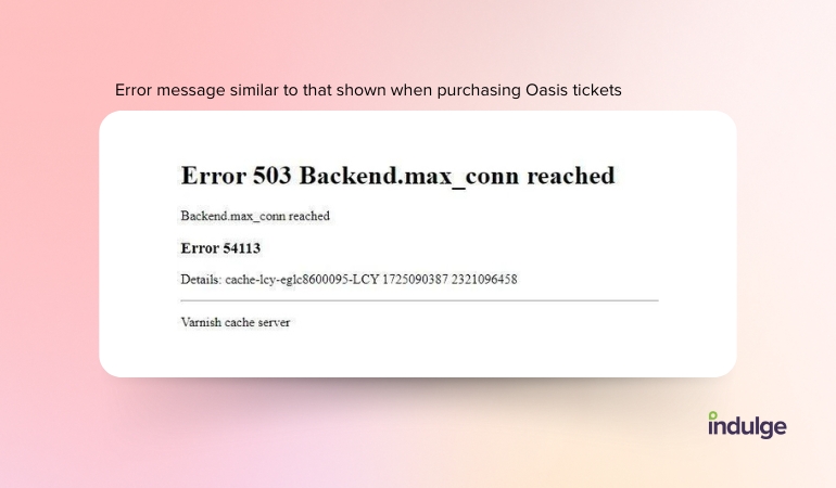
That’s not feedback, that’s the digital equivalent of a shrug of the shoulders.
Every website, no matter how busy it happens to be needs to display errors that are meaningful and that offer a ‘what next?’
Now, I know the circumstances here are exceptional, but that’s the fault of the system that launched the Oasis tickets in the manner in which it did.
Despite this, if all else fails, Ticketmaster should have made its error messaging system far more useful.
There must be a better way
So, what is the better way? Here’s what Pat and Russ have to say.
Pat takes a look at how the digital strategy could have been fixed
I was one of the unfortunate hordes of forty-somethings who parked their children on a device at 7AM on Saturday and proceeded to waste the next five hours within the seventh circle of hell, otherwise known as the Ticketmaster website.
Even though I did make it to the front of the 265,000-strong queue for one of the Dublin gigs, there were no tickets left for me to purchase.
After a loud torrent of obscenities, I dragged my shocked and square-eyed children to the park to try and calm myself down.
Since that debacle, I have been mulling over how utterly appalling the whole ticket-purchasing process was, and how it could be improved.
From Oasis to Glastonbury, buying tickets for in-demand events is horrendous. The fundamental issue is that these firms are launching all of the ticket sales for each gig in one go; in this instance 9 AM on a Saturday.
Despite the implementation of all sorts of queues and other mechanisms, dealing with 20 million people each with 10 browser tabs, refreshing them every 5 seconds, is never going to end well. What did they expect? You could throw millions of pounds worth of hosting infrastructure at that problem and it would still fall over.
It’s a complete lottery; you only have a small chance of making it through to the point where you can buy a ticket. Most people will fail and will waste a large chunk of their day in the process.
Surely a better approach would be to actually turn it into a lottery, where the winners get the opportunity to buy a ticket, in their own time.
It would work like this:
Registration
They open registration for the ticket lottery at a certain date and time and keep it open for two weeks. There is no race to get registered because there is no limit on the number of people who can register. As such, the site does not suffer a huge traffic peak, and so it stays online.
During the registration process, you go through a few checks such as a CAPTCHA, double opt-in against your email address, and store some payment card details. This will help to prevent bots from registering.
You pay a fee of £1 for your registration; an even more powerful way to discourage bots, whilst also generating additional revenue for the band (also discouraging some of the more unethical pricing practices we have seen in action?)
If you want a better chance of winning, perhaps you could buy another registration, up to a maximum of ten or something like that. Just like buying a lottery ticket.
The draws
Once registration has closed, the draws can start; note the plural here.
Every day, a few thousand winners would be randomly selected from the people who had registered.
If you were lucky enough to be selected, you would then be able to log into your account and purchase your choice of tickets from the website. In your own time. From a site that works.
There would be a 7-day window, so if you failed to action your purchase, another space would open up in the next draw.
The draws would continue until all the tickets had gone, with the size of each draw being managed to sell out a couple of months before the event. This would ensure people have time to organise travel and accommodation.
The outcome
Ultimately this approach would achieve several really positive outcomes:
- The punters would be spared the hell of trying to buy tickets along with millions of other people all at the same time. Instead, they spend five minutes registering, then it’s just a waiting game.
- The ticket providers wouldn’t have to invest huge amounts of money and resources in preparing their hosting architecture for a massive, unmanageable surge in traffic.
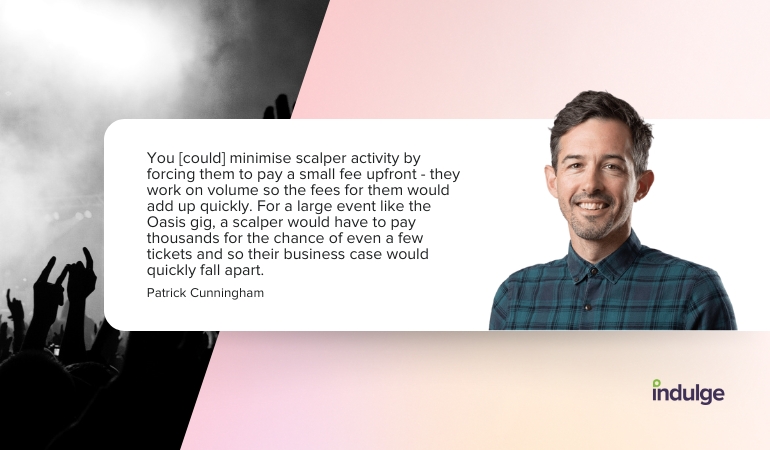
- You would minimise scalper activity by forcing them to pay a small fee upfront - they work on volume so the fees for them would add up quickly. For a large event like the Oasis gig, a scalper would have to pay thousands for the chance of even a few tickets and so their business case would quickly fall apart.
Whilst I’ve always been more of a raver than a rocker, I’ve always been a massive Oasis fan. The best gig I ever went to was Oasis at the Milton Keynes Bowl.
Desperate to relive that moment, I tried my best to secure some tickets, but failed miserably along with millions of others, leaving a bitter taste in my mouth.
I certainly won’t be rushing to buy tickets for Oasis’ next tour unless they roll out a better ticketing solution.
Russell breaks down how the user experience could have been improved
How to present useful error messages
To improve UX and make the ticket booking process less of a headache, the website's system status should have been clearly communicated to keep users informed about what is going on. This allows users to understand the outcome of their interactions and creates trust in your product, while reducing errors.
If there were no tickets available then the “Find tickets” button should have been inactive, with a clear notification message on the page, informing users that no tickets were available. Taking this approach would have provided a clear visual indication the button would not do anything and the message would clarify why the website was not functioning and providing the service expected by the users.
NN/g quote, “Design effective error messages by ensuring they are highly visible, provide constructive communication, and respect user effort.”
The technical 503 error message, which some users experienced once they thought they were at the front of the queue, should have been a message using plainspoken, human-readable language. It’s best to avoid technical jargon and precisely describe the issue, offering constructive advice and empathising with the fact someone has been sitting for hours waiting to get a ticket.
Visibility of system status and how to help users recognise, diagnose, and recover from errors form part of the 10 key Usability Heuristics for User Interface Design by NN/g.
How to avoid dark patterns
The dynamic price surge that was applied to “in demand” tickets left customers with a difficult decision to make if they made it to the checkout process. By this stage, they were already heavily invested in the process and faced the choice of whether to purchase a ticket at over twice the price than they originally thought or close their browser and leave that decision to the next-in-line.
Ticketmaster communicated via a pop-up how the event organiser had priced tickets according to their market value, which had increased due to demand.
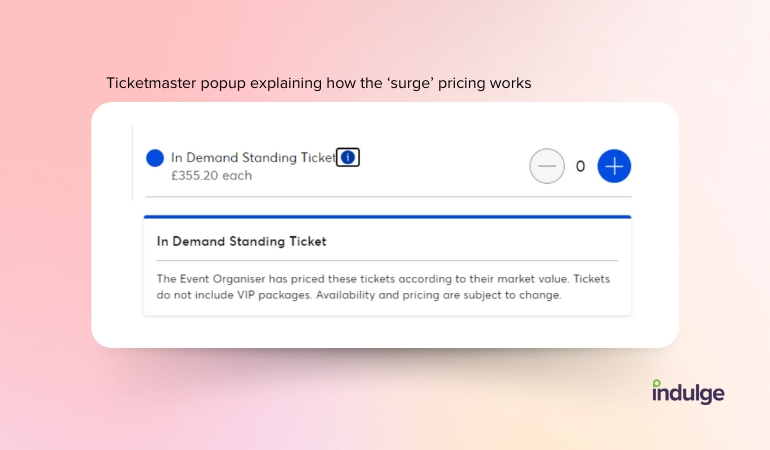
A dark pattern in UX design refers to an interface or user journey that has been crafted to benefit the business, such as increasing sales, collecting data or getting users to sign up for services they might not want. One of these dark patterns is hidden costs. I doubt anyone queuing for an Oasis ticket would have expected the ticket cost to have surged to more than £350, up from £135 when the sale began.
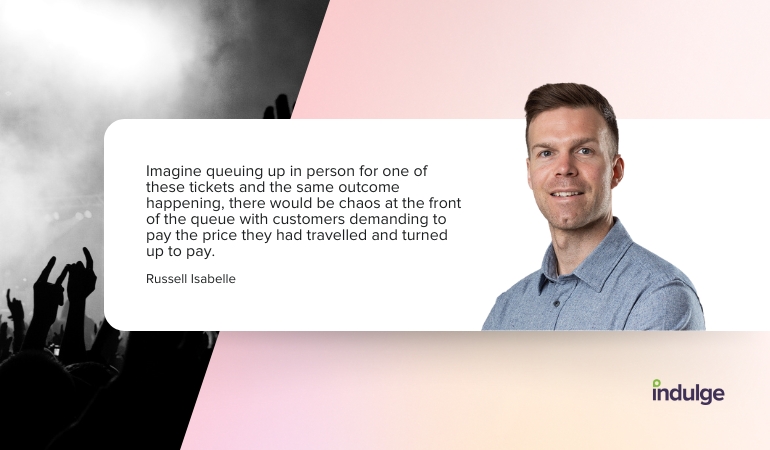
Imagine queuing up in person for one of these tickets and the same outcome happening, there would be chaos at the front of the queue with customers demanding to pay the price they had travelled and turned up to pay.
Dark patterns are unethical and unfair, price surging takes advantage of the user’s trust in the ticket booking system. The change in ticket pricing at the end of the process was at a point where users had already invested a huge amount of time and were unable to make a clear decision. Many customers would have paid a price for tickets they might not have been able to afford.
The main issue here and why it’s considered a dark UX pattern is that there was a lack of transparency around dynamic pricing throughout the process from the start.
How to make it easier to browse venues and ticket
The process of selecting the venue and date for the Oasis tickets was problematic and confusing, but there are ways that Ticketmaster could have improved the process for customers:
- Display a clear system status if tickets are available or not
- If buttons are not functional make them inactive
- Show a clear indication of where you are in the process through a step navigation
- Provide advice on how to navigate successfully through the process e.g. avoid being seen as a bot
- Ensure the process is accessible and caters for a wide range of abilities, including screen readers
- Use plain English in error messages with constructive actions
- Communicate the booking system uses dynamic pricing from the start if it does
Enjoy the show
So, if you are one of the lucky few who managed to get some tickets and you were able to part with the money you had budgeted, then great work.
It means you managed to circumvent a truly poor user experience and you’ll enjoy a great show, I’m sure.
The sad truth is that for (probably) everyone who took part, it was a painful experience. Some will have gained tickets but lost hours of time and sanity. Many will have purchased tickets at far above the price they had originally budgeted for. More still will have missed out.
It’s a shared experience I’m sure nobody wants to share again.


